Description
THE WORLD IS ONLINE. BUT WHERE ARE WE REALLY?
Notifications never stop.
Screens never sleep.
Every scroll introduces another distraction. Every platform demands another moment of attention. Every day, we’re surrounded by endless information, expectations, and digital noise.
Somewhere between staying connected and keeping up with everything, it’s easy to lose track of the world happening right in front of us.
OFFLINE SOCIETY questions that reality.
Part of G’EN’s experimental FDROP collection, this graphic T-shirt explores modern digital culture through unconventional artwork, social commentary, and rebellious streetwear expression.
It’s not simply about avoiding technology.
It’s about questioning how much control we allow it to have over our attention, identity, and everyday lives.
THE DESIGN — A VISUAL REBELLION
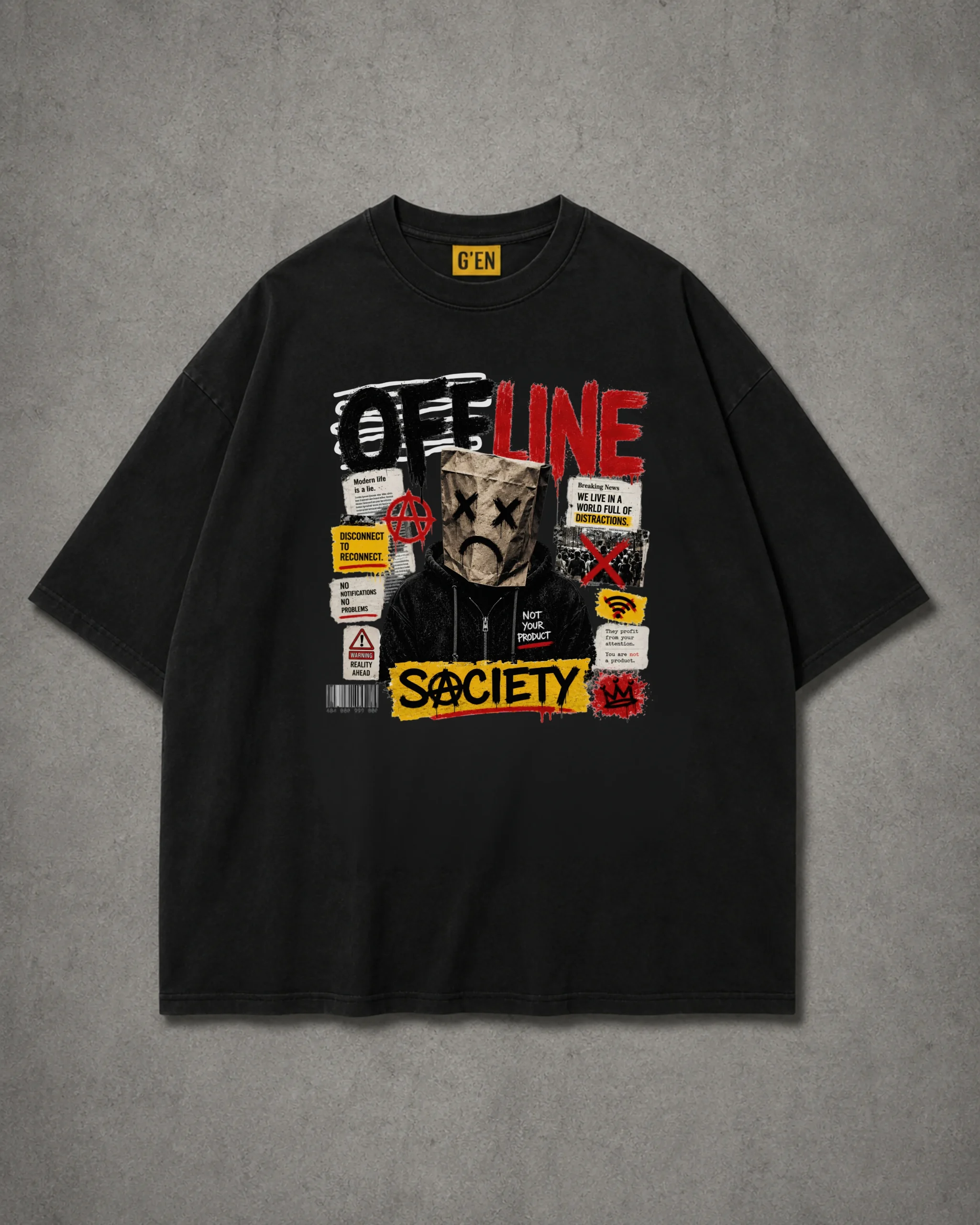
At the center of the black T-shirt sits a striking collage-style graphic combining photography-inspired illustration, distressed lettering, newspaper textures, and provocative visual details.
The upper section features the word “OFFLINE” in oversized, rough-edged typography, combining black, white, and deep-red elements.
The lettering has an intentionally imperfect, painted appearance that reflects the raw energy of underground posters and rebellious street graphics.
Beneath it stands the mysterious central figure.
Dressed in a dark hooded jacket, the figure’s face is concealed behind a crumpled brown paper bag.
Two black crosses replace the eyes.
A simple downward-curving mouth creates a sad, exhausted expression.
This unconventional character becomes the emotional center of the artwork.
Anonymous, disconnected, and surrounded by messages, the figure reflects the overwhelming nature of modern digital existence.
Surrounding the character is a dense arrangement of graphic elements.
Torn-paper textures, warning symbols, crossed-out marks, newspaper-style clippings, a barcode, and distressed red illustrations create the appearance of a rebellious street poster.
Several messages stand out:
“DISCONNECT TO RECONNECT.”
“NO NOTIFICATIONS. NO PROBLEMS.”
“WE LIVE IN A WORLD FULL OF DISTRACTIONS.”
“NOT YOUR PRODUCT.”
Each statement contributes to the design’s central theme: reclaiming individuality in a world increasingly shaped by screens, algorithms, and digital expectations.
At the bottom, the word “SOCIETY” appears in bold yellow against a distressed rectangular graphic.
The typography adds a striking final contrast, grounding the composition in a recognizable streetwear aesthetic.
Together, these details create a design that feels like a visual protest against digital exhaustion.
THE STORY BEHIND THE DESIGN
OFFLINE SOCIETY explores the complicated relationship between human identity and modern technology.
We live in a time when connection has never been easier.
We can communicate instantly, share experiences across continents, and access limitless information.
Yet constant connectivity can also create pressure.
Pressure to respond.
Pressure to stay informed.
Pressure to remain visible.
Pressure to present a perfect version of ourselves.
OFFLINE SOCIETY challenges the expectation that everyone must always be available.
The masked figure represents the anonymity and emotional exhaustion that can emerge within digital environments.
Its paper-bag face suggests a loss of individuality — a person reduced to a simplified expression while surrounded by endless information.
The crossed-out eyes can be interpreted as a rejection of constant observation, distraction, or the pressure to absorb everything happening online.
The sad expression introduces another layer: the emotional weight of navigating a world that rarely slows down.
The surrounding warning signs, distressed typography, and torn-paper graphics reinforce this sense of disruption.
But beneath the apparent chaos, the design carries a meaningful message.
Sometimes, disconnecting is how we reconnect with ourselves.
NOT YOUR PRODUCT — THE QUESTION OF DIGITAL IDENTITY
One of the most thought-provoking statements in the artwork is:
“NOT YOUR PRODUCT.”
In an increasingly digital world, attention has become valuable.
Online platforms compete for engagement, personal information, and the time people spend interacting with content.
OFFLINE SOCIETY approaches this reality through artistic expression rather than offering a simple answer.
The statement questions what happens when individuality becomes shaped by algorithms, online popularity, or the need for constant validation.
Are we choosing what we genuinely enjoy?
Or are we sometimes following what is placed in front of us?
Are we expressing ourselves freely?
Or are we adjusting our identities to match digital expectations?
The artwork encourages reflection on those questions.
It suggests that personal identity should remain something we define for ourselves.
Your attention has value. Your individuality has meaning. Your existence is more than a profile.
DISCONNECT TO RECONNECT
Another defining message within the artwork is the phrase:
“DISCONNECT TO RECONNECT.”
This statement introduces a sense of balance to the design.
While much of the graphic communicates frustration with digital overload, this phrase points toward a more intentional relationship with technology.
It’s about making space for experiences beyond a screen.
Real conversations.
Uninterrupted moments.
Creative freedom.
Personal reflection.
Time that belongs entirely to you.
OFFLINE SOCIETY isn’t necessarily about rejecting modern technology.
It’s about remembering that being constantly connected isn’t the same as being fully present.
THE ART OF CONTROLLED CHAOS
Visually, OFFLINE SOCIETY embraces the experimental character of G’EN’s FDROP collection.
The design takes inspiration from underground poster culture, distressed newspaper graphics, street-art collage, and contemporary social commentary.
Unlike minimalist pieces built around a single symbol, OFFLINE SOCIETY intentionally combines numerous elements within one compact composition.
Each fragment contributes to the larger story.
The bold headline establishes the theme.
The masked figure introduces emotion.
The surrounding statements add meaning.
The distressed textures create movement.
And the strong colour contrast gives the artwork its unmistakable streetwear identity.
Despite the complexity of the graphic, the solid-black T-shirt provides visual balance, keeping the overall appearance wearable.
From a distance, it appears as a bold graphic statement.
Up close, the smaller messages reveal a deeper commentary about modern life.
DESIGN HIGHLIGHTS
- Bold distressed OFFLINE SOCIETY typography
- Anonymous figure wearing a paper-bag mask with crossed-out eyes
- Provocative messages about digital overload and social expectations
- Newspaper-inspired clippings and torn-paper collage textures
- Red graffiti symbols, warning signs, and barcode details
- High-contrast black, white, red, and yellow artwork
- Underground poster-inspired visual composition
- Centrally positioned statement graphic
- Relaxed, oversized-style silhouette shown in the mockup
- Fusion of contemporary streetwear, dark humour, and social commentary
- Part of G’EN’s unconventional FDROP collection
Reviews
There are no reviews yet.