Description
LANGUAGE HAS RULES. CREATIVITY DOESN’T HAVE TO.
Every culture has its own visual language.
Letters, symbols, patterns, and artistic traditions carry stories shaped by generations of expression.
But what happens when familiar visual structures are rearranged, distorted, and reimagined?
Something entirely different begins to emerge.
SCRIPT COLLISION explores that creative intersection.
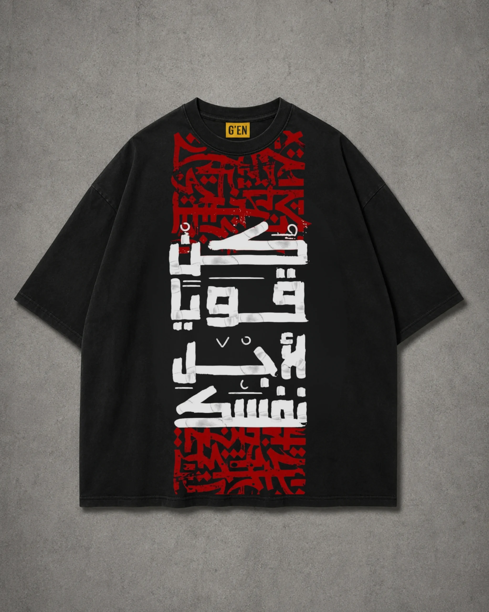
Part of G’EN’s experimental FDROP collection, this graphic T-shirt combines calligraphy-inspired forms, distressed lettering, and bold urban composition to create a design that challenges conventional typography.
It’s an exploration of language as visual art — expressive, unconventional, and open to interpretation.
THE DESIGN — A COLLISION OF VISUAL LANGUAGES
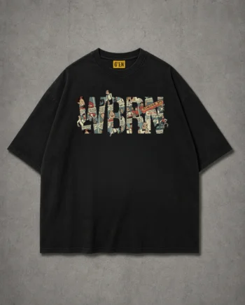
At the center of the black T-shirt sits a striking vertical composition extending from the upper chest toward the lower torso.
The artwork combines two contrasting visual elements.
The first consists of intricate deep-red letterform patterns arranged across the upper and lower sections of the design.
These dense graphic elements feature angular shapes, intersecting strokes, and distressed textures that evoke the energy of hand-painted calligraphy and underground street art.
Their layered arrangement creates a sense of movement and visual complexity.
Between these red sections sits a collection of bold white script-inspired forms.
The white shapes feature thick, expressive strokes and irregular edges, creating a strong contrast against both the red ornamental elements and the solid black background.
The composition moves vertically, guiding the viewer’s attention through the different layers of lettering and decorative forms.
Rather than relying on conventional illustrations, the artwork uses the visual qualities of typography itself as the main design element.
The result is bold, architectural, and distinctly unconventional.
THE STORY BEHIND THE DESIGN
SCRIPT COLLISION is inspired by the idea that expression can exist beyond conventional boundaries.
Throughout history, typography and calligraphy have served purposes beyond ordinary communication.
They have become forms of identity, artistry, cultural expression, and visual storytelling.
The shapes of letters can communicate energy even before their meaning is understood.
A sharp angular form can feel powerful.
A flowing curve can suggest movement.
A distressed texture can introduce rawness and imperfection.
SCRIPT COLLISION brings these visual qualities together in a single composition.
The dense red patterns represent complexity, movement, and layered creative influences.
The bold white forms create moments of contrast, interrupting the visual structure with a stronger graphic presence.
Together, these elements offer a visual metaphor for individuality.
Just as different letterforms can occupy the same composition, contrasting ideas and influences can coexist within a person’s identity.
You don’t have to belong to one style.
You don’t have to follow one aesthetic.
And you don’t have to limit your creativity to a familiar set of expectations.
THE POWER OF CONTRAST
One of the defining features of SCRIPT COLLISION is its restrained colour palette.
Rather than introducing numerous competing colours, the design works with just three dominant tones:
Black. White. Deep Red.
The black base provides the foundation.
The white forms introduce clarity, visual weight, and bold contrast.
The distressed red patterns add intensity, texture, and movement.
Together, these elements create a strong graphic identity while maintaining the versatility associated with monochrome and dark-toned streetwear.
The vertically structured composition also distinguishes SCRIPT COLLISION from traditional centered graphic prints.
Its elongated arrangement creates a dynamic visual appearance that complements the relaxed proportions shown in the T-shirt mockup.
EXPERIMENTAL BY NATURE
SCRIPT COLLISION belongs to a style of streetwear that values graphic experimentation over predictable design.
There are no conventional illustrations or oversized motivational slogans.
Instead, typography becomes the artwork.
Decorative patterns become visual texture.
And contrasting forms become a statement of creative independence.
The result is a piece that feels connected to underground art, experimental design, and contemporary urban culture.
DESIGN HIGHLIGHTS
- Large vertical calligraphy-inspired graphic composition
- Bold white abstract letterforms with expressive edges
- Intricate deep-red ornamental and typographic patterns
- Distressed textures inspired by underground graphic art
- High-contrast black, white, and red colour palette
- Fusion of experimental typography and contemporary streetwear
- Extended central artwork for a distinctive visual arrangement
- Relaxed, oversized-style silhouette shown in the mockup
- Part of G’EN’s experimental FDROP collection
Reviews
There are no reviews yet.